Complementary Colour Finder
Select a colour to find its complementary match:
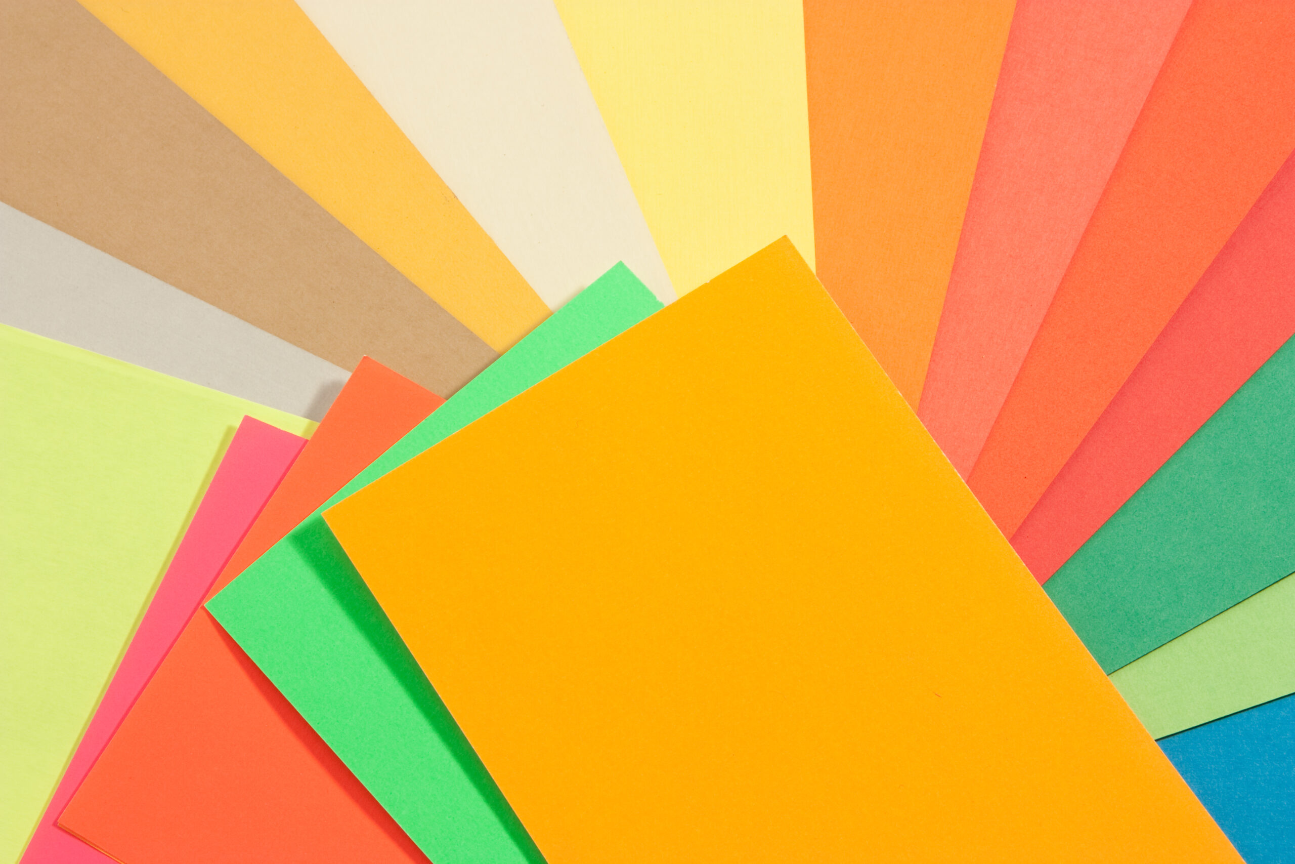
Complementary Colour Finder: What It Is and How to Use It
Choosing the right colours can make or break a design. Whether you’re creating a website, designing a logo, painting your living room, or simply putting together an outfit, colours play a huge role in how people feel and react. One of the easiest and most effective ways to create striking visuals is by using complementary colours—two colours that are directly opposite each other on the colour wheel.
That’s where a Complementary Colour Finder tool comes in. Instead of guessing or manually calculating which colours work together, this handy tool instantly shows you the complementary colour of any shade you pick. In this article, we’ll cover what complementary colours are, why they matter, how the tool works, and step-by-step instructions on how to use it.
What Are Complementary Colours?
Complementary colours are pairs of colours that sit opposite each other on the colour wheel. When used together, they create a strong contrast and make each other stand out. Some classic examples include:
- Red and Green
- Blue and Orange
- Yellow and Purple
These combinations are commonly seen in branding, advertising, art, and even nature. Think of how a bright green leaf pops against a red flower, or how a sunset blends oranges and blues for a breathtaking effect.
Why Complementary Colours Matter
Complementary colours are powerful because they:
- Enhance contrast – They make designs more dynamic and eye-catching.
- Create balance – Opposites attract, and using complementary colours provides natural visual harmony.
- Evoke emotion – Different pairs can trigger different moods (warm vs cool, energetic vs calm).
- Work across industries – From fashion to interior design to web development, colour pairing is universal.
If you’ve ever felt that your design “just doesn’t pop,” chances are the colours aren’t working together. Using complementary colours is a quick fix.
What Is the Complementary Colour Finder Tool?
The Complementary Colour Finder is an online tool that helps you quickly discover the complementary match of any colour. All you have to do is select a colour, and the tool automatically calculates and displays the opposite shade.
Instead of spending time with physical colour wheels or trying to invert colours manually, the tool does the work instantly and accurately. It’s perfect for:
- Graphic designers
- Web developers
- Artists and illustrators
- Interior designers
- Students learning colour theory
- Anyone planning creative projects
How the Complementary Colour Finder Works
The tool uses a simple but effective method: it inverts the RGB values of your chosen colour to find the opposite shade.
Here’s a quick example:
- You select blue (#3498db).
- The tool calculates the complementary colour by subtracting each RGB value from 255.
- Blue becomes its complementary shade: orange (#cb6724).
Both colours are then displayed side by side so you can immediately see how they pair.
Step-by-Step Guide: How to Use the Complementary Colour Finder
Using the tool is quick and straightforward. Here’s how:
1. Pick a Colour
Open the tool and select a colour using the built-in colour picker. You can choose any shade—whether it’s bright, dark, pastel, or muted.
2. See Your Selected Colour
The tool will display your chosen colour in a box with its hex code (a 6-digit code used in digital design, like #3498db).
3. View the Complementary Colour
Next to your chosen colour, you’ll see its complementary match instantly appear. The tool shows both the colour itself and its corresponding hex code.
4. Apply It to Your Project
Once you have both colours, you can use them in your designs. For example:
- Graphic design – Apply them to backgrounds and text.
- Web design – Use one for primary buttons and the other for hover states.
- Fashion – Coordinate clothing and accessories.
- Home decor – Pair paint colours or fabrics for a bold look.
Benefits of Using the Complementary Colour Finder
Here’s why this tool is a must-have for creatives:
- Saves time – No need to manually calculate colour opposites.
- Boosts creativity – Experiment with bold new palettes.
- Accurate results – Based on RGB inversion, ensuring precision.
- Accessible – Works directly in your browser without special software.
- Beginner-friendly – Perfect for people who don’t know much about colour theory.
Real-Life Examples of Using the Tool
- Branding: A coffee shop chooses a warm brown as their main brand colour. The Complementary Colour Finder suggests a teal shade for accents, giving the brand a fresh, modern feel.
- Web Design: A blogger wants their call-to-action button to stand out. They pick navy blue as the main site colour, and the tool suggests orange for the button—perfect for catching attention.
- Interior Design: A homeowner loves pale green walls but doesn’t know what curtains to buy. The tool suggests pinkish-red shades for a natural but bold contrast.
Pro Tips for Using Complementary Colours
- Use one as dominant, one as accent – Too much of both can feel overwhelming.
- Adjust saturation and brightness – Muted versions of complementary colours often look more elegant.
- Combine with neutrals – Add white, grey, or black to balance strong colour pairings.
- Experiment with variations – Try analogous or triadic colours for expanded palettes.
Final Thoughts
The Complementary Colour Finder is a simple yet powerful tool that can transform the way you work with colours. Whether you’re designing a website, decorating your home, or planning a creative project, it helps you make confident, visually appealing choices in seconds.
By understanding and applying complementary colours, you’ll bring balance, energy, and harmony to your work. And best of all, the tool makes it effortless—just pick a colour and get its perfect match instantly.
So next time you’re stuck wondering, “What colour goes with this?”, try the Complementary Colour Finder and let it do the work for you.
Leave a Reply